Showing posts with label In Depth project. Show all posts

Tuesday, December 12, 2017

In depth: Final Project


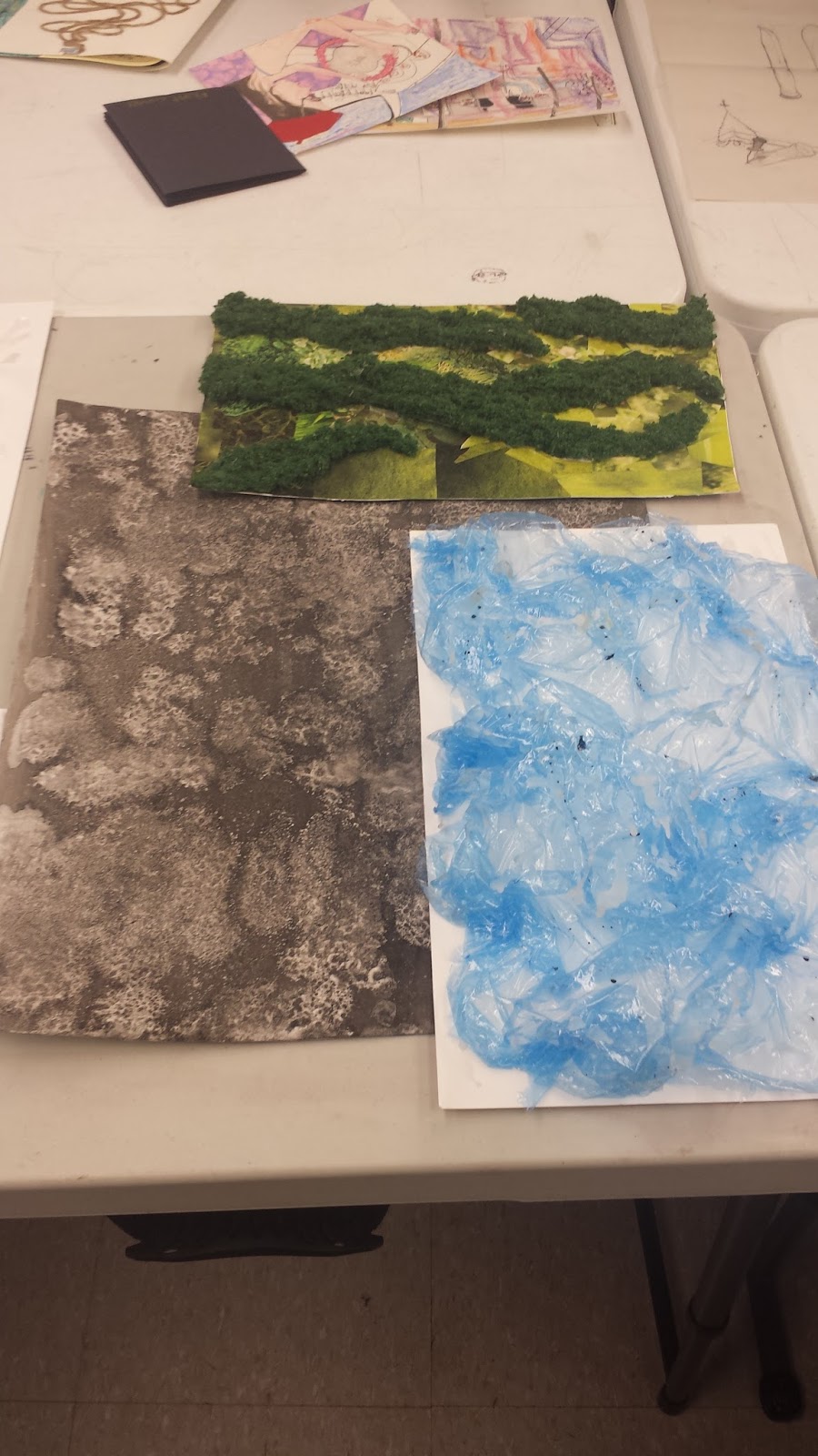
For this final In depth project I wanted to try a technique I learned several months ago in my drawing II/ mark making class using shaving cream and acrylic paints. With this piece I wanted to experiment more with psychic automatism, technique of the subconscious drawing which the artist allows their unconscious mind to take control. Automatic painting is a style of painting in which paint is applied directly to the canvas without any planning or preconceived ideas. 

When creating this piece I used my left hand to be less in control of the gestural movements and marks that were being applied to the paper. For the first layer I applied the technique with the shaving cream and acrylic paints. The second layer was when began to apply 
psychic automatism to my artwork, using my left hand instead of my dominant hand (right) to paint with white gesso, black India ink, and apply bleach and salt using various objects to assist my gestural movements and marks making process.  In addition, for my final layer I went over the gestural marks with the same technique I used in my first layer. After I applied drippings of bleach and dashes of salt on the painting.  

Creating this painting was tedious with the process of mixing the colors, drying time, and layering the paint, overall I really enjoyed making the piece because it allowed me to relax and have more freedom, spontaneity in gestural movements and marks that I was applying to the paper. During the whole process of making this painting I was nervous about how it was going look once I completed the last layer, with each layer I saw the piece becoming what I had pictured in my mind. 


Friday, December 1, 2017

Narrative: Zine

For this project we were to create our own narrative on 8 pages, including a package for the zine to fit in as well as three small sculptures to go along to convey the story behind the zine.

First, we brought in our original artworks that were going to be on the zine. As a class we laid out our original artworks, book mock-up showing pagination and structure/orientation. From there, the next time we would meet we were required to bring 5 printouts for the zine, 3 hand-held sculptures, and the container/structure package and demonstrate how it all goes together.

I chose to create the narrative of my zine about ecological issues within the ocean. I took photographs of the artworks (close-ups, focused/out of focus), used information about the environmental issues to help convey my message to the reader.


Evaluation:

As a class we were given each one a Self-evaluation zine package handout, and another to critique a peer's zine package. The images below depict my self-evaluation zine package about my sculptures, zine and package, the other is of my peer whom I gave feedback to about their artwork, and the other self evaluation is of a fellow classmate who evaluated my zine package. 


I created my zine package out of  recycled plastic water bottles to discuss the issue of pollution. Plastic is a non- biodegradable material that is discarded in the ocean that ends up in one of the 5 gyres (located in five different oceans). This material causes an impact on marine life, leading to death by entanglement, suffocation, and digestion (food). 
My three sculptures depict a mangrove tree (conservation/preservation of the mangrove trees) using chicken wire and grass material, fish entangled in a bottom trawling net wrapped in fishing line and plastic wrap (pollution) using aluminum foil, netting material, fishinglin  and a coccolithophore (carbon absorbing algae/carbon cycle) created with plastilina clay. 

My zine was integrated with the package, illustrates materials using ecological issues within the ocean and the text explains what the effects on the environment are. Each zine edition has different facts about how the material affects the environment, and images (close-ups, focused/out of focus) of the original artwork used to create the zine.  I bounded the zine together using fishing line which is a material that causes many issues with marine life deaths because of entanglement and suffocation due to harmful fish practices and technique's.


Tuesday, November 14, 2017

In Depth project: Landscape


With this In Depth project I wanted to expand a bit more with material exploration and the continuation of the city Saphronia from the Calvino reading. 
Based on the phrases from the reading, "Great rollercoaster with its steep humps" "Carousel with its chain spokes" "Ferris wheel of spinning cages" "Death ride" I depicted what these phrases held in common. I found that these things were: Metal, Electricity, oil, and danger. 

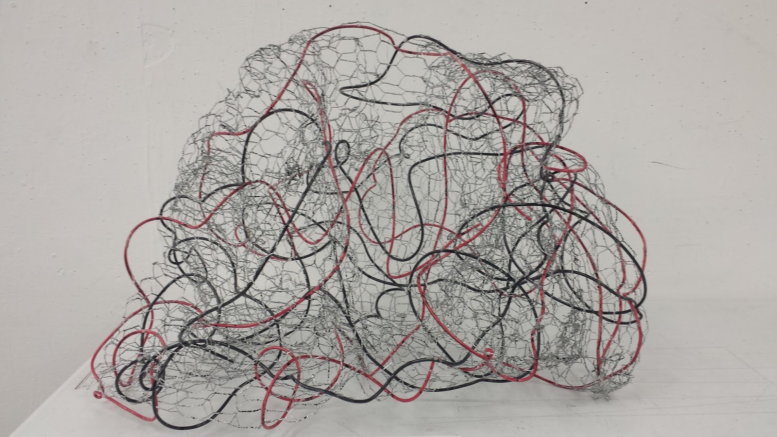
I experimented with beading wire at first but it was a bit more difficult to manipulated the way I wanted, needed a malleable metal that covered more surface area. I chose chicken wire instead, conveyed my concept more fitting than the beading wire. I started by cutting the chicken wire and forming small and large portions, then connecting them together to form the entire structure itself.

After, I began to weave in the red electrical wire, during this process I was planning and thinking about how much wire I wanted woven in or exposed on the frame of the sculpture. I used 12 gauge red and black electrical wire to illustrate how the machines operate, powered by. I wove the electrical wire through the entire sculpture with the intention of depicting the dynamic movement of a roller coaster. I wanted to portray a hazardous and perilous roller coaster with sharp turns, curves, twists, and loops that would be in the one half of the city of Saphronia.
In addition, I spilled India ink on the sculpture to help illustrate the (oil and petroleum) that helps run the engine of these machines.   

Even though I might be difficult to see in the photographs, I added food coloring (red, blue, green, yellow). I dripped the various colors on the piece to experiment with this material that I have never used before. The coloring from the India ink and food coloring stayed on the piece but it took several days to dry because of the metal did not absorb the liquid medium thoroughly.


Saturday, November 4, 2017

In Depth Portrait/Propaganda


This is a two-part assignment.  Work may be created in any medium, but each work should be no smaller than 12” in the smallest dimension.

Part A) students will create a portrait of an individual and must choose whether to depict the subject as admirable or ignoble.  This choice will be realized through specific formal choices—composition, color, line weight, energy, texture, scale, contrast, etc.—in the medium of their choice.  The portrait should also be a good representational likeness of the individual, and not an abstraction or substitution (e.g.: a person must be represented by a person, and not by a bottle, or a cow, for example).  No smaller than 12” in the smallest dimension.

Part B) Students will next create a form of propaganda—some combination of text/speech and image that will promote a message opposite that of the portrait about the same subject.  For example, if you depicted one of your professors as destitute, intimidating, and horrible in a portrait, then your propaganda should promote them as rich, welcoming and wonderful.  No smaller than 12” in the smallest dimension.

In the propaganda you may feel free to use a personified representation of your subject—you may depict a bottle or cow, which has the characteristics of your subject in place of your subject, for example.  The propaganda may be created using the medium of your choice, though the requirement to use text may make some of you feel limited—consider that there are many ways to use text; it doesn’t simply have to be a digital insertion.  Formal choices will also be important in the propaganda.  


Wednesday, October 11, 2017

In-Depth Project: Abstraction of the form

Based on the color we received in class from the method of choosing a color from picking a number out of four. It lead my group to have to top section of the chair because we were given the color pink. With the cropped top section of my chair I created an abstraction of the form with inspiration from Piet Mondrian's paintings of the "De Stijl" style.

With the design I created which was influenced from the Norwegian/Swedish pattern type called "Rosemaling", incorporated the pattern to the canvas using Mulberry paper and wove yarn in circular movement using yellow, green, blue red, and violet. I wanted to depict abstraction using color. When I was planning how I was going to communicate my concept on the canvas I thought about I how I wanted the yarn to link together to form an abstraction of intersecting colors.


This was the first time I have worked with yarn before and used it on a canvas, incorporated Mulberry paper in a project before. I enjoyed the process itself from planning out my concept in my sketchbook to sewing the yarn within the canvas to and drawing the pattern on the Mulberry paper.